Summer time means time for Blazor – and Web Components
Blazor will feature this summer again at bbv. This time we will demonstrate how Web Components can be used in .Net Blazor. Just like the Angular or React JavaScript frameworks, Blazor is also component-based and uses its own component technology. What this means though is that use on a project-wide basis is prevented. Web Components provide a remedy here.

What are Web Components?
Web Components are HTML components that can be used independently of the framework. The HTML elements standardised in 2012 by W3C are now supported by commonplace browsers. Web Components are code blocks that encapsulate HTML elements, CSS and JavaScript. They enable use independently of the web UI framework. This blog article does not deal with the creation of Web Components, rather focuses on their use in Blazor. Further information on creating Web Components can be found online, for example, at cyon.

Say goodbye to tired eyes – with short lines of code

“The real AI hype is yet to come”

Delight instead of frustration: What good UX design has to do with trust

How web developers reduce complexity
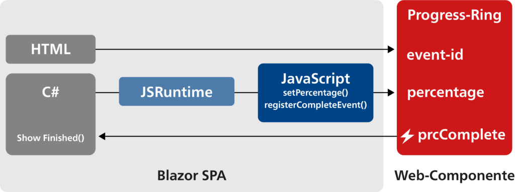
2. Usage in Blazor
The author uses a Progress Ring component here in Version 1.0.24 from webcomponents.org, which was created with Stencil.
   <script type="module"
        src=https://unpkg.com/progress-ring-component@1.0.24/dist/progressring/progressring.esm.js >
</script>
The Web Component is imported into Blazor in index.html with a script tag.
2.1 Setting parameters
The HTML element is then ready to be used.
<progress-ring percentage="60" ></progress-ring>
In this example, the percentage is passed to the ‘percentage’ attribute as a parameter.
Values can also be set in C# code. @ref from Blazor is used here. This allows a reference to the HTML element as a property in the C# code.
<progress-ring @ref="ringElement" ></progress-ring>

public ElementReference ringElement { get; set; }

await JSRuntime.InvokeVoidAsync("setPercentage", ringElement, 40);
The percentage ‘40’ is passed to the HTML element with JS interop.
const setPercentage = (element, value) => {
element.percentage = value;
};
The value itself is set with a small JavaScript function in the element.
2.2 Subscribing to an event
The author displays a text in the Blazor component as soon as the animation of the Progress Ring has ended. When the end of the animation is reached, the Progress Ring fires a ‘prcComplete’ event.
<progress-ring @ref="ringElement" event-id="123" ></progress-ring>
It is clear from the documentation of the Progress Ring component and following some examination of the JavaScript code that the Events component is only sent when the ‘event-id’ attribute is set.
private DotNetObjectReference<Index> objRef = null!;

objRef = DotNetObjectReference.Create(this);
To be able to call a C# handler for this event, we need a JS interop reference (objRef in this case) to the implementing instance. This reference must be destroyed after use with Dispose() in order to avoid memory leaks.
    await JSRuntime.InvokeVoidAsync("registerCompleteEvent", ringElement,
objRef, "OnComplete");
In this example, an ‘OnComplete’ method is registered on the ‘ringElement’, which is implemented by ‘objRef’.
[JSInvokable("OnComplete")]
public void ShowFinished(string elementId)
{
    DoneText = $"{elementId} is done!";
    StateHasChanged();
}
The handler method is invoked with JS interop and therefore has be attributed with JSInvokable. A separate ‘OnComplete’ identifier is used here. This can also be omitted. The method name (ShowFinished in this case) is crucial in this case. However, the author recommends using a separate identifier since this simplifies refactoring.
const registerCompleteEvent = (element, dotNetTarget, identifier) => {
element.addEventListener('prcComplete',
    () => dotNetTarget.invokeMethodAsync(identifier, element.id)
);
};
The register JS function registers a lambda on the ‘prcComplete’ event, which invokes the ‘ShowFinished’ method on the ‘objRef’ instance. The ID of the HTML element is passed on here as well. It also has to be set for this purpose however.
<progress-ring id="ProgressRing" @ref="ringElement" event-id="some id" />
2.3 Result
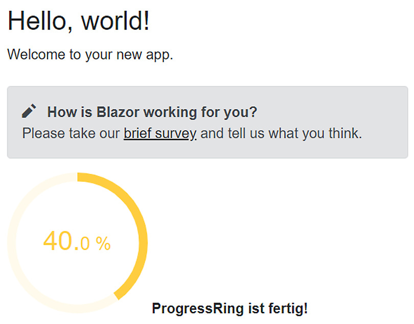
The Progress Ring is displayed in the Blazor component. When the 40% mark is reached, the text “ProgressRing is done!” is displayed in Blazor.
3 Conclusion
Web Components are a variant for providing reusable components. To use their full functionality, however, the Blazor developer cannot avoid at least a bit of JavaScript. The author would like to see more UI elements other than Web Components from library producers. Web Components will feature this summer in addition to Blazor – to the delight of the author!

Author
Othmar Christen
Othmar Christen is a Senior Software Engineer at bbv. As a full-stack .NET developer, he is a proponent of efficient solutions. This includes advising customers expertly and implementing their requests, even if it is not always the latest technology. In line with the motto: The customer’s wish is my command.
